Bootstrap – Typography

<!DOCTYPE html>
<html lang=”en”>
<head>
<title>Bootstrap Example</title>
<meta charset=”utf-8″>
<meta name=”viewport” content=”width=device-width, initial-scale=1″>
<link rel=”stylesheet” href=”http://maxcdn.bootstrapcdn.com/bootstrap/3.2.0/css/bootstrap.min.css”&gt;
<script src=”https://ajax.googleapis.com/ajax/libs/jquery/1.11.1/jquery.min.js”></script&gt;
<script src=”http://maxcdn.bootstrapcdn.com/bootstrap/3.2.0/js/bootstrap.min.js”></script&gt;
</head>
<body>

<div class=”container”>
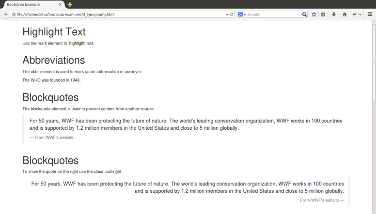
<h1>Highlight Text</h1>
<p>Use the mark element to <mark>highlight</mark> text.</p>
</div>
<div class=”container”>
<h1>Abbreviations</h1>
<p>The abbr element is used to mark up an abbreviation or acronym:</p>
<p>The <abbr title=”World Health Organization”>WHO</abbr> was founded in 1948.</p>
</div>
<div class=”container”>
<h1>Blockquotes</h1>
<p>The blockquote element is used to present content from another source:</p>
<blockquote>
<p>For 50 years, WWF has been protecting the future of nature. The world’s leading conservation organization, WWF works in 100 countries and is supported by 1.2 million members in the United States and close to 5 million globally.</p>
<footer>From WWF’s website</footer>
</blockquote>
</div>
<div class=”container”>
<h1>Blockquotes</h1>
<p>To show the quote on the right use the class .pull-right:</p>
<blockquote class=”pull-right”>
<p>For 50 years, WWF has been protecting the future of nature. The world’s leading conservation organization, WWF works in 100 countries and is supported by 1.2 million members in the United States and close to 5 million globally.</p>
<footer>From WWF’s website</footer>
</blockquote>
</div>
<div class=”container”>
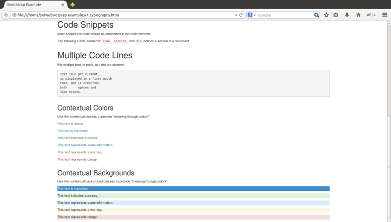
<h1>Code Snippets</h1>
<p>Inline snippets of code should be embedded in the code element:</p>
<p>The following HTML elements: <code>span</code>, <code>section</code>, and <code>div</code> defines a section in a document.</p>
</div>

<div class=”container”>
<h1>Multiple Code Lines</h1>
<p>For multiple lines of code, use the pre element:</p>
<pre>
Text in a pre element
is displayed in a fixed-width
font, and it preserves
both spaces and
line breaks.
</pre>
</div>

<div class=”container”>
<h2>Contextual Colors</h2>
<p>Use the contextual classes to provide “meaning through colors”:</p>
<p class=”text-muted”>This text is muted.</p>
<p class=”text-primary”>This text is important.</p>
<p class=”text-success”>This text indicates success.</p>
<p class=”text-info”>This text represents some information.</p>
<p class=”text-warning”>This text represents a warning.</p>
<p class=”text-danger”>This text represents danger.</p>
</div>
<div class=”container”>
<h2>Contextual Backgrounds</h2>
<p>Use the contextual background classes to provide “meaning through colors”:</p>
<p class=”bg-primary”>This text is important.</p>
<p class=”bg-success”>This text indicates success.</p>
<p class=”bg-info”>This text represents some information.</p>
<p class=”bg-warning”>This text represents a warning.</p>
<p class=”bg-danger”>This text represents danger.</p>
</div>

</body>
</html>
typography1 typography_2

Bootstrap – Dynamic design for phone, tablets, desktops, larger desktops – Part 2

The Bootstrap grid system has four classes: xs (phones), sm (tablets), md (desktops), and lg (larger desktops). These classes can be combinated to create more dynamic and flexible layouts.

<!DOCTYPE html>
<html lang=”en”>
<head>
<title>Bootstrap Example</title>
<meta charset=”utf-8″>
<meta name=”viewport” content=”width=device-width, initial-scale=1″>
<link rel=”stylesheet” href=”http://maxcdn.bootstrapcdn.com/bootstrap/3.2.0/css/bootstrap.min.css”&gt;
<script src=”https://ajax.googleapis.com/ajax/libs/jquery/1.11.1/jquery.min.js”></script&gt;
<script src=”http://maxcdn.bootstrapcdn.com/bootstrap/3.2.0/js/bootstrap.min.js”></script&gt;
</head>
<body>

<div class=”container-fluid”>
<h1>Hello World!</h1>
<p>Resize the browser window to see the effect.</p>
<div class=”row” style=”background-color:lavender;”>
<div class=”col-xs-12 col-md-8″>.col-xs-12 .col-md-8</div>
<div class=”col-xs-6 col-md-4″>.col-xs-6 .col-md-4</div>
</div>
<div class=”row” style=”background-color:lavenderblush;”>
<div class=”col-xs-6 col-md-4″>.col-xs-6 .col-md-4</div>
</div>
<div class=”row” style=”background-color:lightcyan;”>
<div class=”col-xs-6″>.col-xs-6</div>
</div>
</div>

</body>
</html>

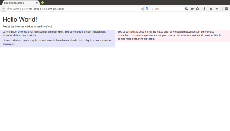
Bootstrap – Dynamic design for phone, tablets, desktops, larger desktops – Part 1

The Bootstrap grid system has four classes: xs (phones), sm (tablets), md (desktops), and lg (larger desktops). These classes can be combinated to create more dynamic and flexible layouts.

<!DOCTYPE html>
<html lang=”en”>
<head>
<title>Bootstrap Example</title>
<meta charset=”utf-8″>
<meta name=”viewport” content=”width=device-width, initial-scale=1″>
<link rel=”stylesheet” href=”http://maxcdn.bootstrapcdn.com/bootstrap/3.2.0/css/bootstrap.min.css”&gt;
<script src=”https://ajax.googleapis.com/ajax/libs/jquery/1.11.1/jquery.min.js”></script&gt;
<script src=”http://maxcdn.bootstrapcdn.com/bootstrap/3.2.0/js/bootstrap.min.js”></script&gt;
</head>
<body>

<div class=”container-fluid”>
<h1>Hello World!</h1>
<p>Resize the browser window to see the effect.</p>
<div class=”row”>
<div class=”col-sm-3 col-md-6 col-lg-4″ style=”background-color:lavender;”>
<p>Lorem ipsum dolor sit amet, consectetur adipisicing elit, sed do eiusmod tempor incididunt ut labore et dolore magna aliqua.</p>
<p> Ut enim ad minim veniam, quis nostrud exercitation ullamco laboris nisi ut aliquip ex ea commodo consequat.</p>
</div>
<div class=”col-sm-9 col-md-6 col-lg-8″ style=”background-color:lavenderblush;”>
<p>Sed ut perspiciatis unde omnis iste natus error sit voluptatem accusantium doloremque laudantium, totam rem aperiam, eaque ipsa quae ab illo inventore veritatis et quasi architecto beatae vitae dicta sunt explicabo.</p>
</div>
</div>
</div>

</body>
</html>

Bootstrap – Basic HTML

</body>
</html>
<!DOCTYPE html>
<html lang=”en”>
<head>
<title>Bootstrap Example</title>
<meta charset=”utf-8″>
<meta name=”viewport” content=”width=device-width, initial-scale=1″>
<link rel=”stylesheet” href=”http://maxcdn.bootstrapcdn.com/bootstrap/3.2.0/css/bootstrap.min.css”&gt;
<script src=”https://ajax.googleapis.com/ajax/libs/jquery/1.11.1/jquery.min.js”></script&gt;
<script src=”http://maxcdn.bootstrapcdn.com/bootstrap/3.2.0/js/bootstrap.min.js”></script&gt;
</head>
<body>

<div class=”container-fluid”>
<h1>Hello World!</h1>
<p>Resize the browser window to see the effect.</p>
<div class=”row”>
<div class=”col-sm-6″ style=”background-color:lavender;”>
<p>Lorem ipsum dolor sit amet, consectetur adipisicing elit, sed do eiusmod tempor incididunt ut labore et dolore magna aliqua.</p>
<p> Ut enim ad minim veniam, quis nostrud exercitation ullamco laboris nisi ut aliquip ex ea commodo consequat.</p>
</div>
<div class=”col-sm-6″ style=”background-color:lavenderblush;”>
<p>Sed ut perspiciatis unde omnis iste natus error sit voluptatem accusantium doloremque laudantium, totam rem aperiam, eaque ipsa quae ab illo inventore veritatis et quasi architecto beatae vitae dicta sunt explicabo.</p>
</div>
</div>
</div>

bootsrap_simple